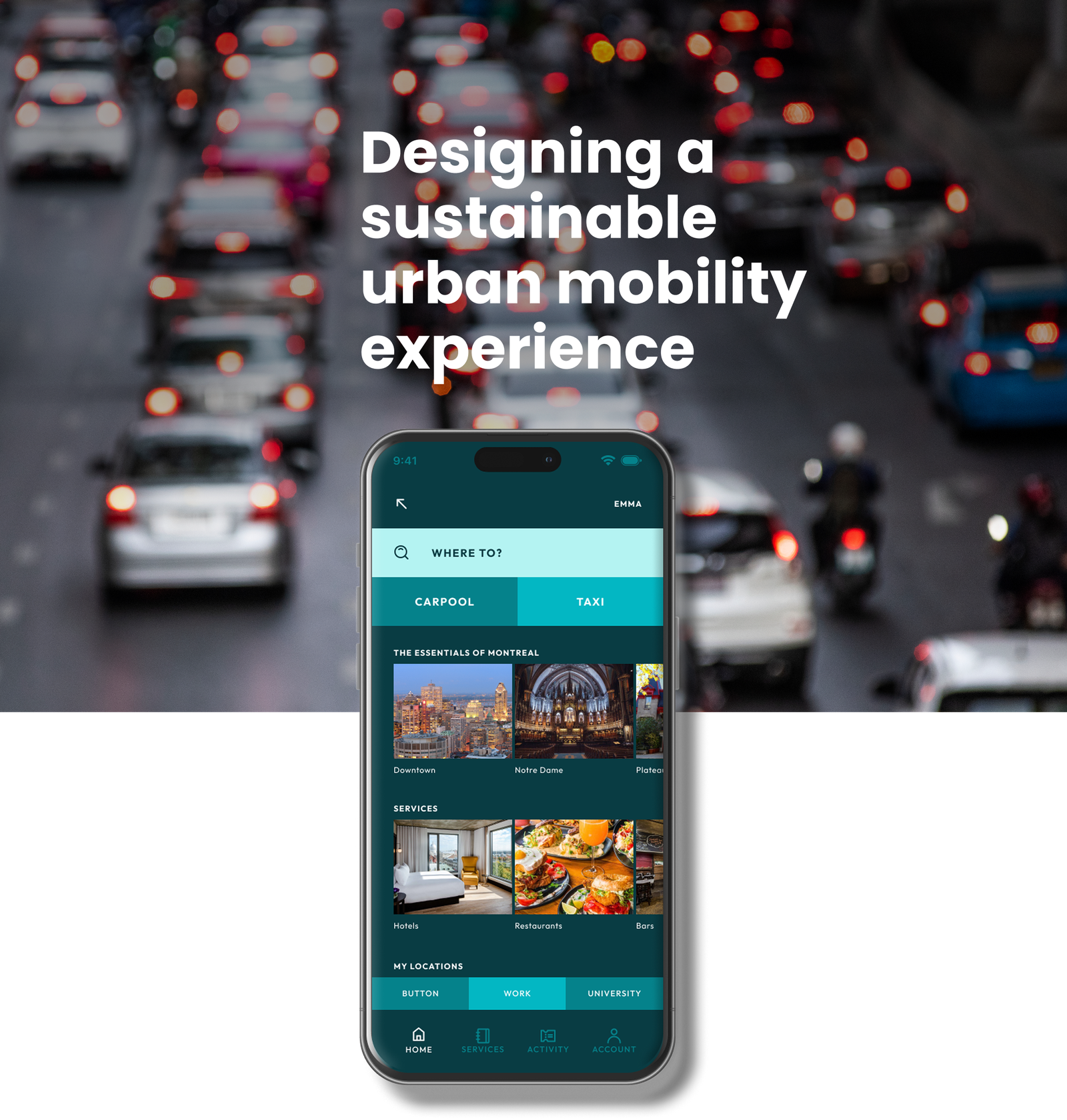
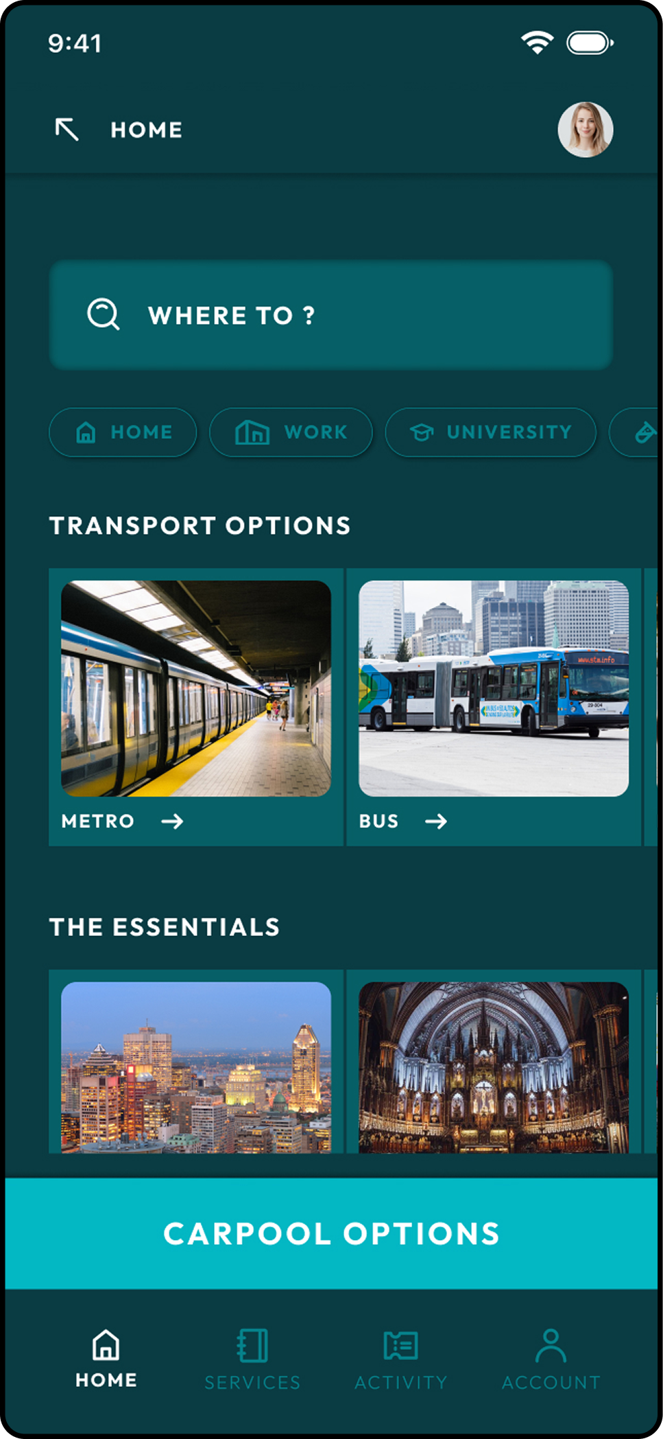
GreenLine is a mobile app concept designed to help people navigate the city in a more sustainable way.
The idea came from a simple observation: while many users care about eco-friendly transportation, existing mobility apps often make sustainable choices harder, not easier. GreenLine explores how UX design can reduce complexity and help users make better decisions with less effort.
Project Overview
Project: GreenLine Project type: Conceptual UX/UI project Platform: Mobile (iOS / Android) My role: UX/UI Designer (end-to-end)
Responsibilities
Problem framing and design goals definition
Information architecture and user flows
Low- and mid-fidelity wireframes
Visual system and UI components
High-fidelity prototypes
Design Goals
The project was guided by the following design goals:
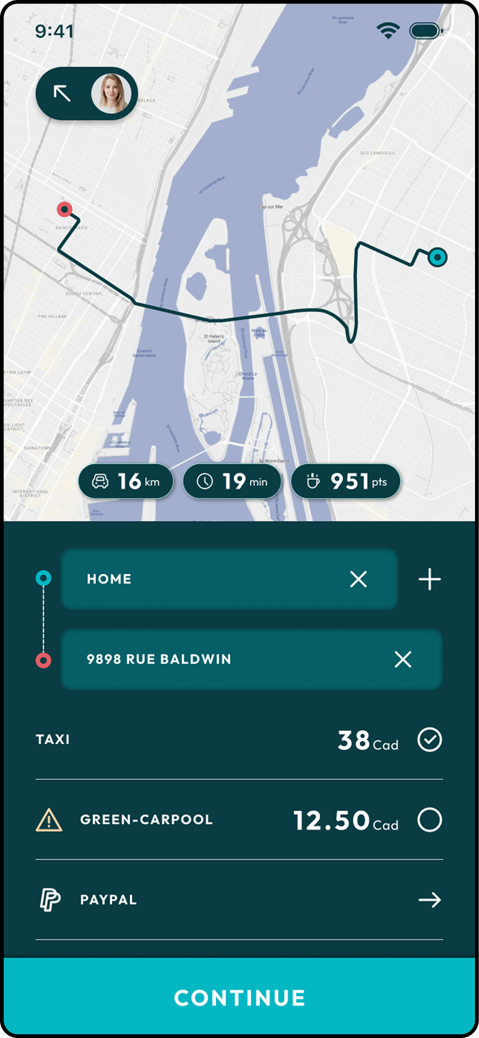
Reduce cognitive load during route planning
Make sustainable options easy to identify and compare
Prioritize clarity and hierarchy over feature density
Create a calm and trustworthy visual experience aligned with ecological values
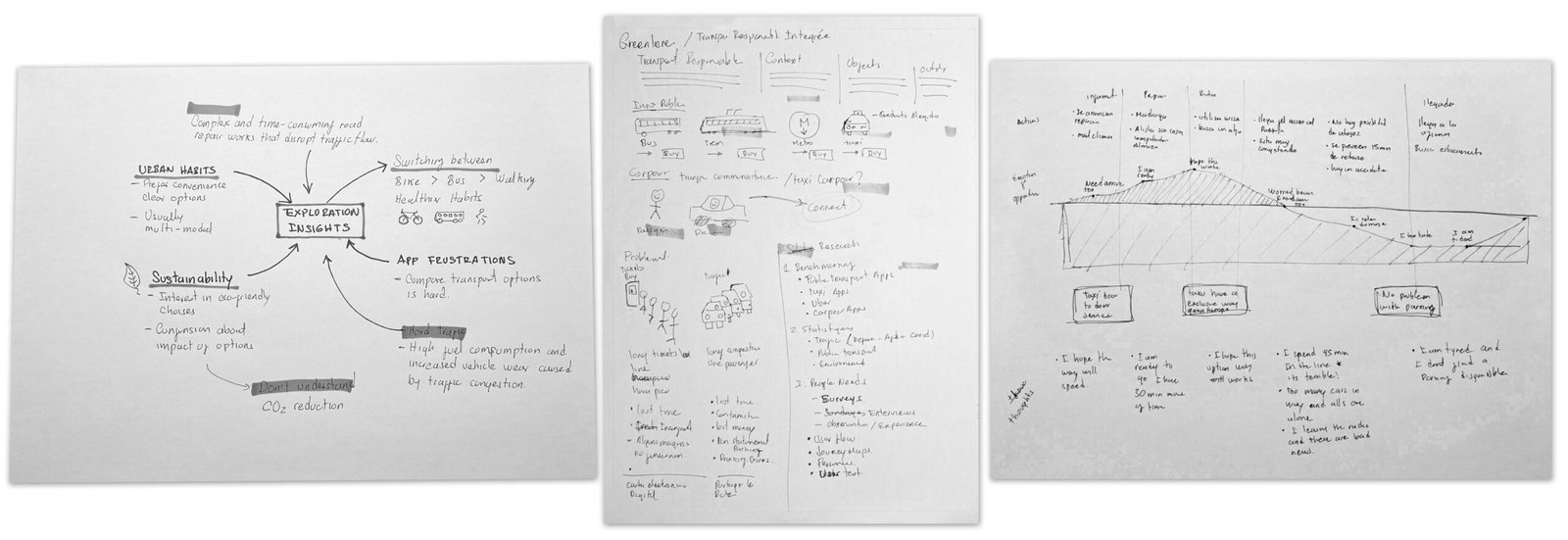
Research & Exploration
At an early stage, I explored common mobility patterns, existing apps, and typical user frustrations. This phase helped clarify what was really essential and what could be removed, allowing the product to stay focused on a small number of meaningful actions..
Wireframes & Flow Thinking
Wireframes were used as a thinking tool rather than a deliverable.
They helped define the main flows, validate navigation depth, and ensure that key actions were always easy to reach. At this stage, the priority was clarity, not visual detail.
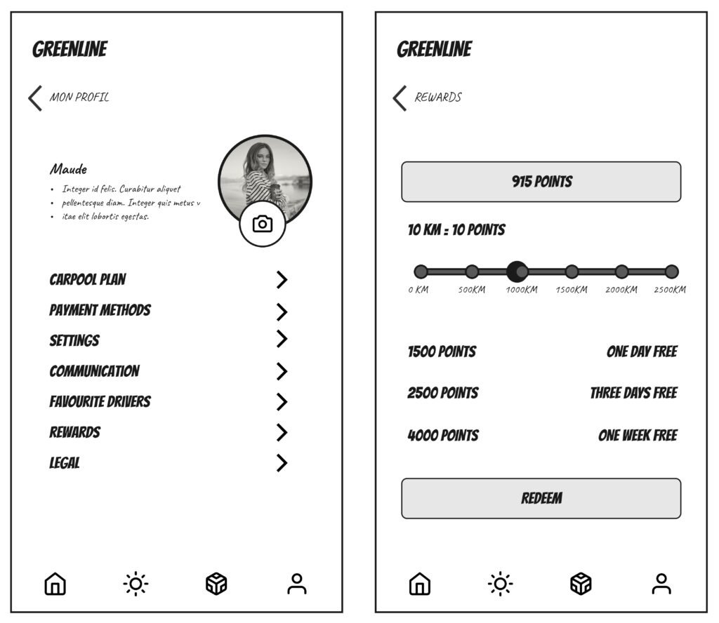
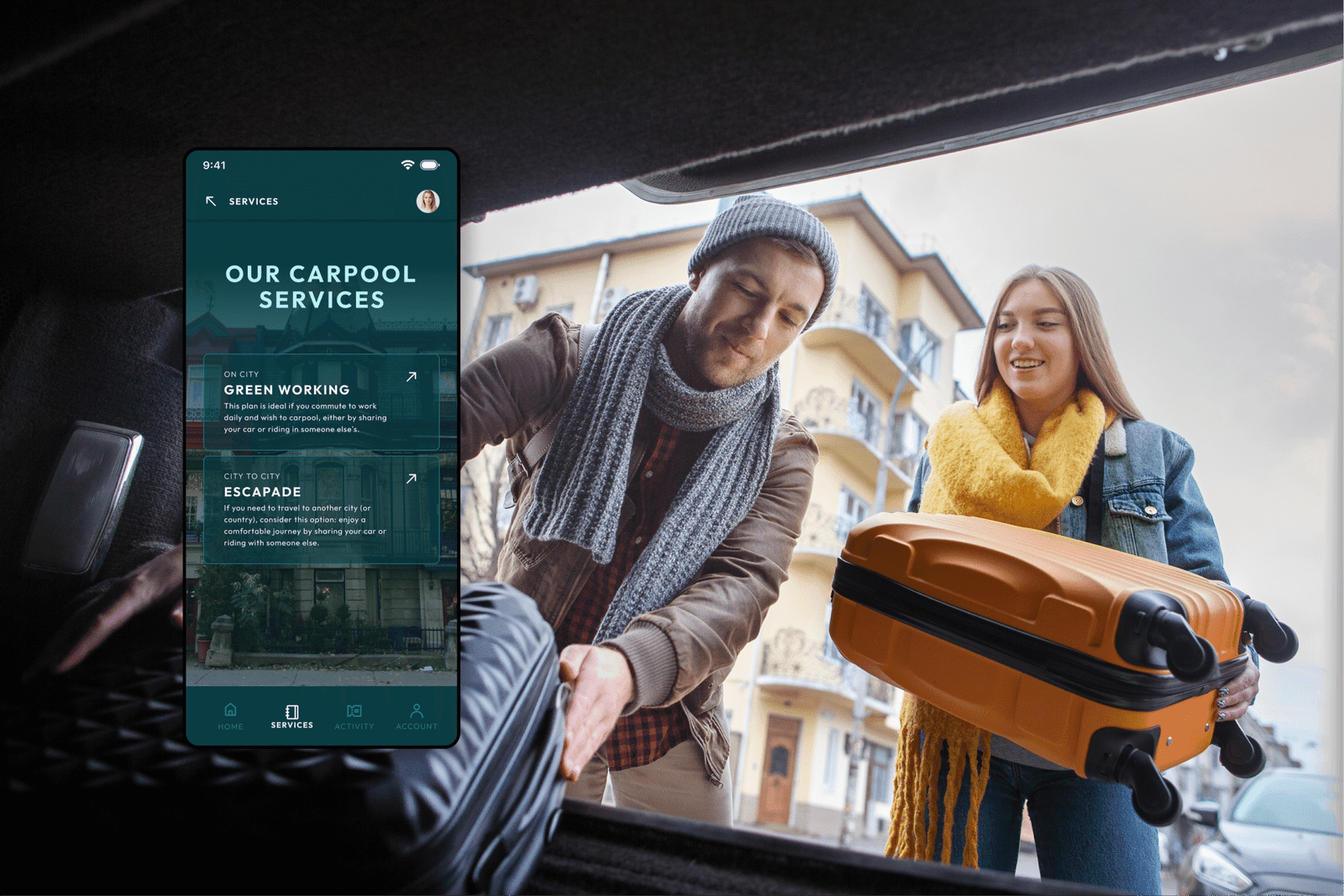
Encouraging user adoption
Exploring ways to encourage users to use Greenline by leasing their vehicles and participating in shared trips. Designing a rewards system that reinforces habitual use for daily transportation needs.
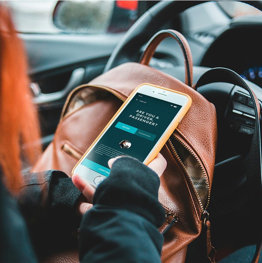
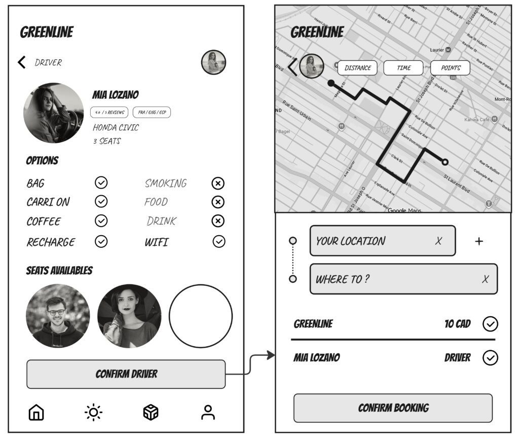
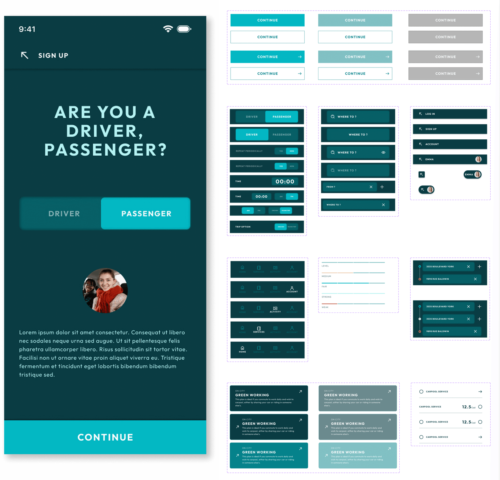
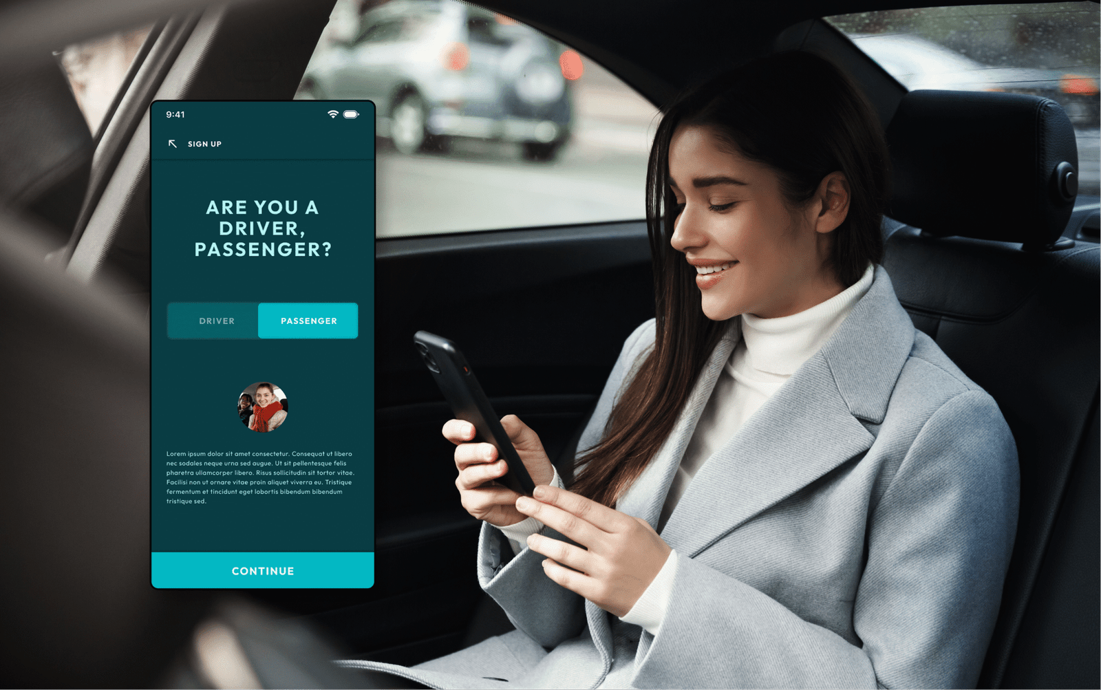
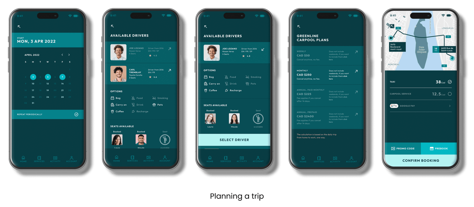
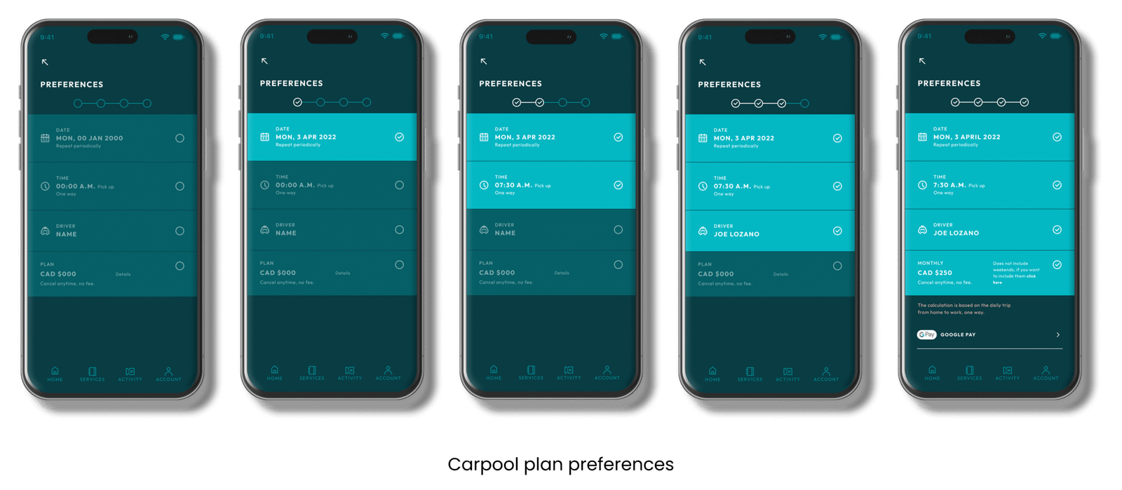
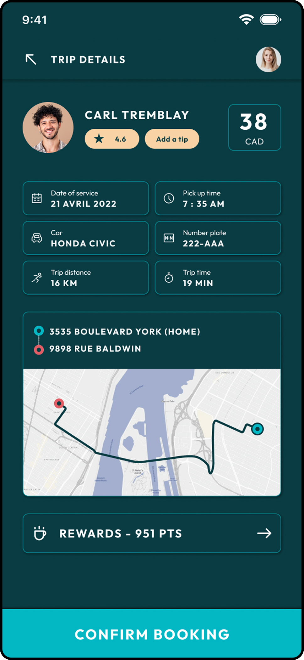
Select Driver and Preferences
In this step, drivers can set preferences for their passengers. Users can see who they’ll be traveling with and specify shared preferences, such as luggage space, coffee breaks, music, or other travel options.
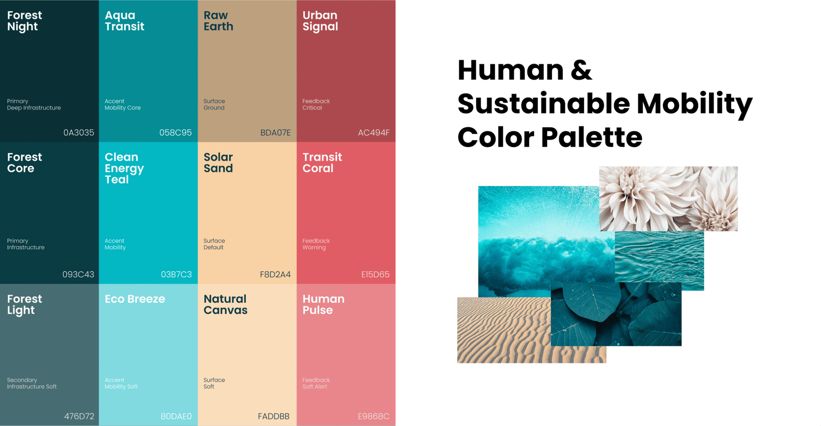
Visual Direction
The visual direction was inspired by natural elements such as water, greenery, and open urban spaces.
The color palette and imagery were chosen to reinforce a sense of trust and environmental awareness, without relying on overly literal “green” visuals.
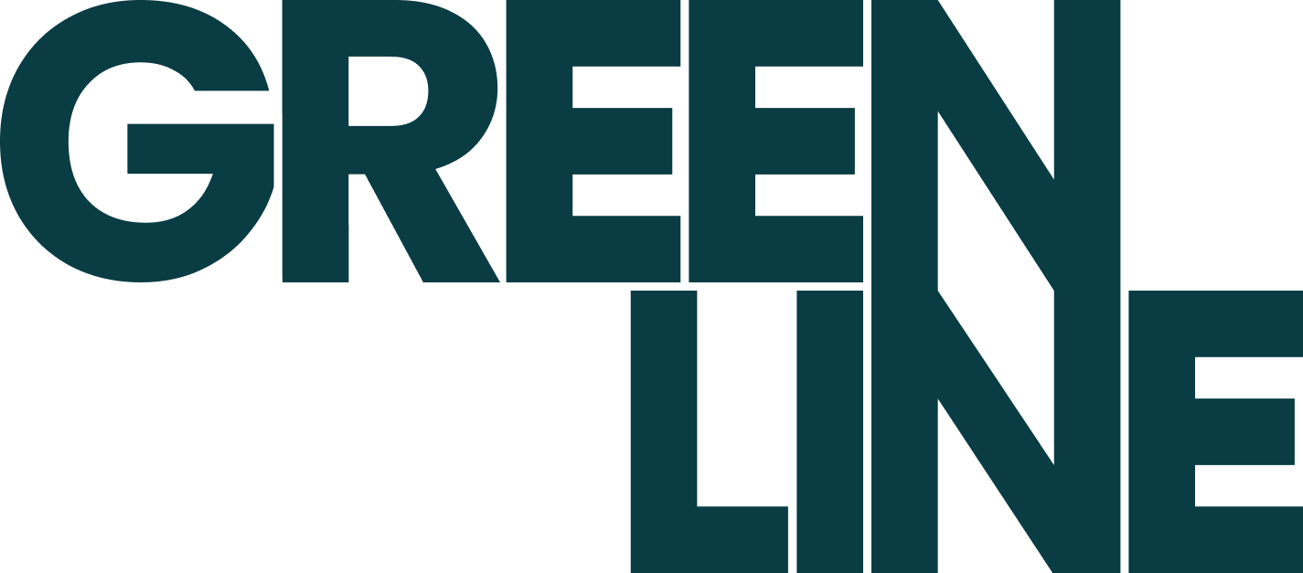
Logotype
The logo I created embraces minimalist typography, using clean lines and a straightforward, legible typeface to express the brand’s essence with clarity and impact. The minimalist approach was intentional—stripping away the superfluous to highlight only what truly matters. This design choice not only enhances memorability and comprehension, but also gives the visual identity a modern, timeless feel that aligns seamlessly with the brand’s personality.
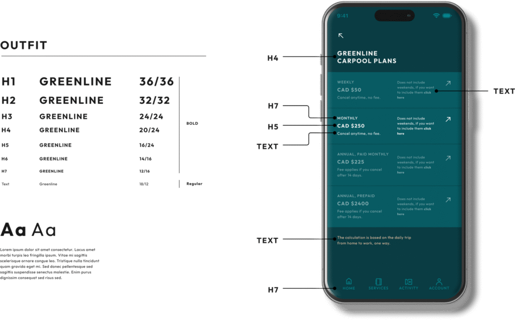
Typography & Readability
Typography played an important role in keeping the experience accessible.
Clear hierarchy and generous spacing help users scan information quickly, which is especially important in mobility contexts where attention is often limited.
Components
Instead of designing screens in isolation, I built a small set of reusable components. This made it easier to maintain consistency across the interface and allowed the design to scale without losing coherence.